
In my previous entry, Fun with Facebook, I described how to pull data from Facebook’s Graph API Explorer, organize it using NodeBox, and turn it into representations of friends, posts, and the “likes” that connect them. Here is the final result:
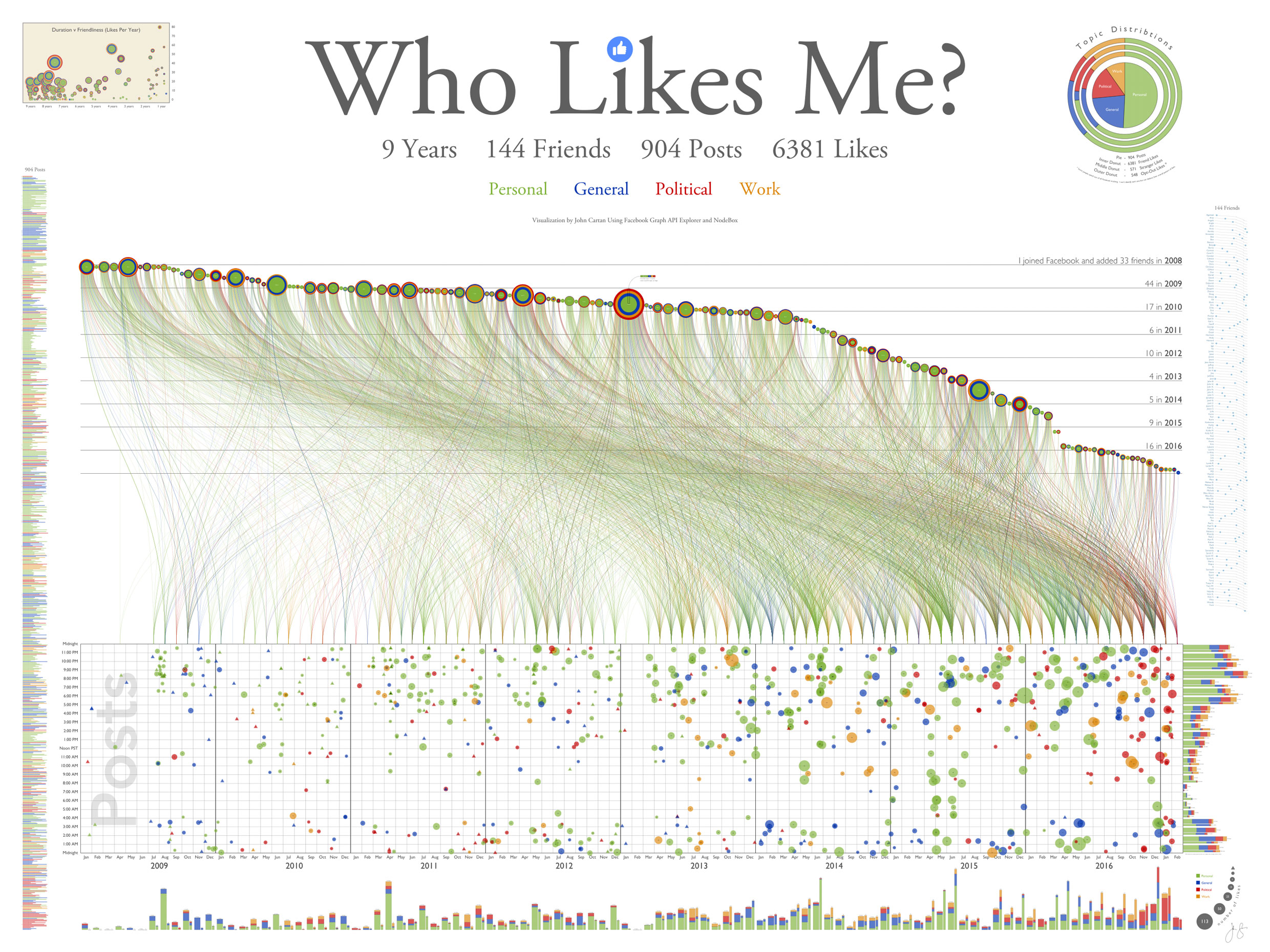
The final “Who Likes Me?” poster
The above image is a snapshot of a high-resolution poster with many fine details. One of my goals for this project was to create a “forest and tree” visualization that pushed the envelope on information density. I wanted to see meaningful patterns from ten feet away while still allowing discoveries in every square inch, so there’s a lot to see.
A four-color topic scheme is used throughout. In the bottom grid each post is represented by a bubble, sized by how many likes it got and colored green for personal, blue for general interest, red for political, and orange for work-related. Post date is on the x axis, post time on the y.

Each post appears as a colored bubble in a date v. time grid
Each of the 6,381 lines rising upward represents an individual like, colored the same as the post being liked. All likes from posts in a given month start at the same fine point and lead to the friend who did the liking. Near the right edge you can see what I call the Trump effect: a higher than usual proportion of reddish political posts and likes in the months around the 2016 election.
Like lines connect the posts in each month to the friends who liked them
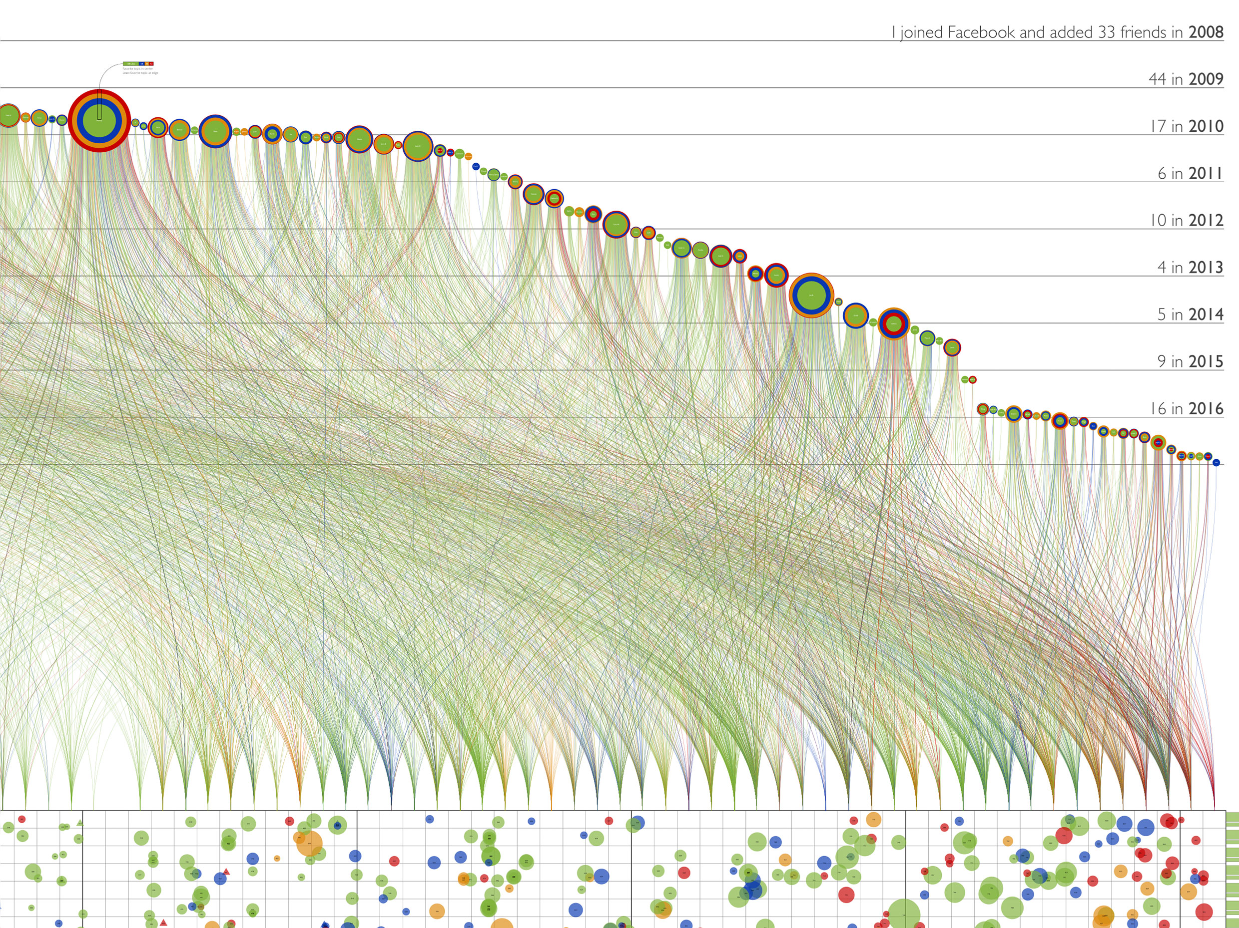
My friends are arranged sequentially from left to right in the order we became friends; their vertical position is based on the date we became friends. I made 33 friends in 2008, 44 in 2009, etc. The more horizontal slope on the left occurs because I was adding friends at a pretty good clip for the first few years. After 2010 the rate slowed resulting in a steeper slope. There is a cliff between the middle of 2014 and the end of 2015 when I only added two friends; I resumed a more steady pace after that.

Each friend “jellyfish” shows likes and topic preferences
Each friend is represented by what I call a jellyfish. The tendrils fanning out below each jellyfish are the colored like lines in chronological order. A full spread indicates a consistent pace of liking over the years; a wishbone pattern indicates a few initial likes, a gap of non-interest, and then a resumption in recent months. If topic preferences change over time this is also revealed in the spread.
The concentric circles in the body of each jellyfish show the proportion of topic preferences, with the most liked kind of post at the center and the least favorite topic at the outside. The rings are sized based on radius, not area, to make outliers more visible. Melody is my champion liker with 304 likes in all. I find these jellyfish fish very revealing; you can see at a glance who is political, how varied their interests are, etc. Each one is unique.

The friend map shows where each friend is located on the friend slope
Since I don’t remember when I connected with each friend it can be difficult finding him or her in the conga line of jellyfish. To make lookups easier I added a reference map on the poster’s right edge. Friends are listed in alphabetical order. Next to each one is a repeat of the distinctive shape of my friend-slope with the position of that friend marked as a blue dot.

The post index shows each numbered post in a giant bar chart
On the left edge of the poster I have placed an index to all 904 posts. Each colored bar holds the post number, date, and initial text of the post’s title or caption. The number of likes follows each bar; a preceding triangle marks the posts no one liked. From a distance this index forms a giant bar chart which shows fluctuations in topic and title size. A long run of green bars, for example, correlates with family vacations.

Stacked bar charts show total posts and likes by month and hour
Stacked bar charts along the right and bottom edges of the post grid show how posts and likes vary from hour to hour and from month to month. The bars come in pairs; wide bars show the total number of posts (broken down by topic), narrow bars show total likes. The two bars are scaled so that whenever a likes bar exceeds a posts bar there are an above average number of likes. The hourly bars reveal my predilection for posting at night and into the wee hours of the morning. A peak in April 2011 of posts (but not likes) marks a road trip with many photo posts apparently of interest only to myself.

The friendliness bubble chart shows friendship duration vs. average liking rate
In the upper left corner I have placed a bubble chart which shows all my friends arranged by duration of friendship on the x axis and “friendliness” (mean likes per year) on the y axis. Newly added friends on the right typically start with an initial infatuation which settles as they get to know me better. One relatively recent Facebook connection, Joyce S., currently likes me four times as often as my wife.

Topic chart shows topic distributions for posts (pie) and likes (donuts)
In the upper right corner a delectable pie chart surrounded by three tasty donuts shows overall topic distributions. The pie shows that just over half of my posts are personal. The three donuts show that friends, strangers, and opt-outs all prefer personal posts over any other flavor; surprisingly, strangers (some of whom I know but have not connected with) like the personal posts even more than my friends.
The opt-outs are friends and strangers who have gone to the trouble of telling Facebook not to share their data with anyone (including me). Although I can’t tell who they are and which posts they liked, the total like counts for each post allow me to deduce their overall preferences as a group. Another lesson of social media: even when you opt out you leave traces behind.
LESSONS LEARNED
Although this ponarv may seem a curious use of my time, the techniques demonstrated here could be applied directly to many different enterprises use cases. Posts could be replaced by any kind of business object (invoices, sales opportunities, customer contacts, etc.) and the friends could be any person or resource associated with those objects.
Learning how to work with and visualize public APIs is certainly relevant for businesses today. Even if they are not already participating in the API economy themselves, our customers will increasingly need to access semi-structured public data from social media and other sources to enhance their own internal reporting. I hope to show examples of this in future blogs.
This project was also part of my research into large-form high-resolution information displays for possible use in video walls, control centers, etc. By pushing the envelope I exposed current limitations both technical and ergonomic.
In fact, I pushed a little too far. The file contains over 20,000 vectors with nearly four million points spanning more than two orders of magnitude in font size. It looks great on my laptop and iPad, but panning and zooming is painfully slow. Browsers struggle with it. I finally concluded that the most effective, high-tech way of displaying it was to print it out on paper.
But this also proved problematic. I settled on a forest and tree size of 52 by 39 inches, the largest available wall space in my cluttered house. The first print shop I approached spent two days trying to print this monster – and finally gave up. At 2400 dpi the file would have taken a minimum of 8 hours to rasterize, and the 11-meg PDF would have ballooned into a TIFF of over 30 gigs (if TIFFs could be larger than 4 gigs – which it turns out they can’t).
A second print shop was finally able to print it, but only by reducing the resolution to 600 dpi. This muddied fine details and left the post index unreadable even with a magnifying glass. I could have rectified this by printing it as a wall-sized mural, but then you would need not just a magnifying glass but a stepladder as well.
Speed, memory and cost will continue to improve and expand what’s possible for high density displays, but even when that day comes visualizations will still need to satisfy human limitations. The differential between tree and forest must always fit comfortably between the need for magnifying glasses and stepladders. Interactive displays can show more, but only if they can zoom and filter instantaneously.

The giant Who Likes Me? poster now dominates my kitchen
I did learn a lot about who likes me, my posting habits, and how unique each friend is. The poster elicited a startled “Yikes!” from my long-suffering wife the first time she walked into our kitchen. Now all I need is more wall space.
How you like me now? Love this.
I started learning NodeBox just because of this post. I just started 2 days ago and did the visualization tutorials. There’s a ton of things I still need to figure out and I definitely need to work on it but hopefully I can build something as awesome as this someday.
Rodge, I am delighted to hear this. NodeBox has a bit of a learning curve but is a wonderful tool for visualization. I volunteer as a mentor on the NodeBox forum (http://support.nodebox.net/discussions). If you have any questions, or need help with a particular project, please don’t hesitate to post in the forum. It’s also a great place to show your work.