
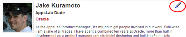
One of the changes we deployed this week to Mix was new icons on profile pages. We replaced the links that used to tell you “Edit your profile”, “Add to network”, “Remove from network” with snazzy, Web 2.0 style icons which showed a pen (for edit), a green plus sign (for add), a red x (for remove).

Since the deployment of the new icons, I’ve had several people send feedback asking how to edit their profiles. This tells me the pen icon, even with hover-over help, wasn’t doing a good enough job. So, we deployed some new buttons, icons and text to make it more easy to use.
This got me to thinking about UI and users.
New Web pushes the design paradigms for usability, and early adopters are very tech savvy. We call them “power users” in enterprise software. Early adopters are obviously not risk averse with regard to UI, meaning they want to tinker and are willing to investigate and probe to figure out a UI. Frequently, they will laud or criticize new usability patterns very openly. It’s all part of the early adopter mindset. Early adopters look at enterprise software and laugh at its moribund UI.
In enterprise software, we’re used to making features as obvious as possible, working within the constraints familiar to users, e.g. functions are buttons, not icons. Enterprise users are not early adopters. They represent the vast majority of computer users, and they want features and functions to be obvious and easy. These users are frustrated at the thin, undocumented UI they see in Web 2.0.
I’m generalizing in both cases to make a point.
The puzzle for New Enterprise Web (NEW, sure Enteprise 2.0 works too) is balancing cutting-edge UI design with established paradigms. On the one hand, sites like Mix seek to introduce new concepts, including UI, to enterprise users so they can reap the benefits. Without them, there is no Mix. On the other hand, Mix needs to show its New Web chops or be written off as another lipstick/pig effort by an enterprise software company that “doesn’t get it” (the ultimate insult in tech).
As the product manager, this is one of my top concerns. How do I balance the two?
This week’s user group activites at Collaborate 08 and recent promotion from Justin have driven a lot of new visitors and traffic to Mix. We’ve increased our userbase by 50% very quickly and will probably pass 12,000 users on Monday.
This problem will get worse, unless I can balance form and functionality in the right amounts for all our users. I know people out there have ideas. Want to help me? You know what to do.
Yes the icon was a change that didn’t work. The great thing is that the nature of how we work and the ability of the web to connect us, told us immediately. We didn’t have to wait months to find out. I would also stress that it’s the participatory model that is different now – not so much the UI. Personally, I have always felt that icons were a bit more 1.0 in the sense of what you’d see on a typical client app. The simple links as buttons (ie. click to save) I find very clean, simple, and intuitive.
That said, there is another lesson here. One that anyone who deals with customers knows. If you hear a complaint from one person, there are 10 more that didn’t bother to say anything, but were unhappy nonetheless. This goes for restaurants, dentists, and yes even software. So when we heard quickly from 5 or 10 people, we jumped, and jumped high.
Paul
Usability testing seems a slippery thing to me; I sat in on a usability testing session recently on some new web apps we are building. The pros running the session seemed to have 2 responses: if the testing results were positive, they high-fived each other because their UI design was great; if the testing results were negative, they explained that the UI features would be adopted by “learned behavior” in time. Either way, the testing did not prompt changes to the UI. I asked them why they did testing at all if the results weren’t actionable. They told me I “didn’t get it”.
It takes discipline and nerve to put something new out; when we rolled out our PeopleSoft Portal 9.0 last fall, we did not make dramatic changes based on individual user comments — reasoning instead that the research we did with our user base to develop the new UI and IA was solid and trustworthy. Now those UI and IA features have been adopted.
Another example of UI gone wild is PeopleSoft Campus Solutions 9.0. This is the best UI yet in ERP applications (I say); but, we had complaints from users when we first rolled it out that there were too many ways to navigate (enterprise menu navigation, embedded links, contextual search, and contextual navigation all on the same page). We noted that these were the same users who complained that navigation in prior version used to be too basic for their sophisticated needs and moved on.
I suppose it is a balance. The AppsLab experiences and blog are helpful and instructive to us who are moving into the NEW world, so thanks.
For what it is worth — I liked the pen icon 😉
-Ted
@Ted: Thanks for sharing your experiences. Did you know Paul used to run PeopleSoft Portal? I think Rich was a developer on that product too.
UI is an 80/20 problem. There are so many types and levels of users that it’s virtually impossible to please everyone. I used to do technical consulting, which included Form design/build in R11 EBS. It was surprisingly tough to please even a handful of users with a Form built totally to their specs.
That’s UI for you. We did keep the pen, albeit within a button.